
Visual Hierarchy: Driving SaaS Product Usability
What makes users feel instantly comfortable with one SaaS product but overwhelmed by another? Clear visual hierarchy is the silent architect behind intuitive interfaces that help users find what they need quickly and act with confidence. For product managers and design leads, mastering these principles means transforming digital complexity into clarity and engagement. Discover how visual hierarchy guides attention and reduces confusion to unlock higher usability and drive stronger interaction in your product.
Table of Contents
- What Visual Hierarchy Means In Product Design
- Core Principles And Patterns In Visual Hierarchy
- Implementing Visual Hierarchy In SaaS Interfaces
- Impact On User Experience And Engagement
- Common Pitfalls And How To Avoid Them
Key Takeaways
| Point | Details |
|---|---|
| Effective Visual Hierarchy Enhances User Experience | A well-executed visual hierarchy minimizes cognitive load and improves user navigation, making interactions feel more intuitive. |
| Strategic Use of Design Elements Is Crucial | Designers should carefully manipulate size, color, and whitespace to guide user attention and convey information priority. |
| Testing and Continuous Refinement Are Essential | Regular user testing and feedback help validate the effectiveness of visual hierarchy and ensure it aligns with user behavior. |
| Avoid Common Design Pitfalls | Overloading information and inconsistent design can lead to confusion, highlighting the importance of balanced and clear layouts. |
What Visual Hierarchy Means in Product Design
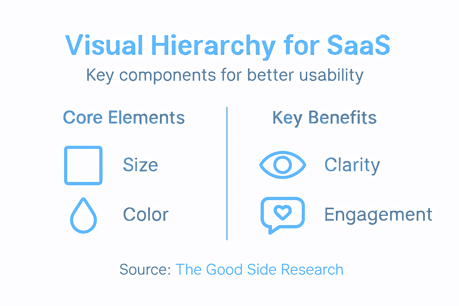
Visual hierarchy represents the strategic arrangement of design elements that guide user attention and prioritize information within a product interface. Foundational principles of visual hierarchy determine how quickly and efficiently users can process and interact with digital experiences.
At its core, visual hierarchy is about creating a clear, intuitive roadmap for users’ eyes and cognitive processing. Designers achieve this by deliberately manipulating design elements like size, color, contrast, whitespace, and positioning to communicate relative importance. These techniques help users understand what matters most without experiencing overwhelming cognitive load.
Key components of effective visual hierarchy include:
- Size and Scale: Larger elements naturally draw more attention
- Color and Contrast: Bright or contrasting colors highlight critical information
- Spatial Positioning: Top-left and center areas typically receive primary focus
- Typography: Font weight, size, and style communicate informational priority
- Whitespace: Strategic empty space helps separate and emphasize different interface sections
Organizational Impact: Visual hierarchy fundamentally guides user flow by minimizing confusion and directing users toward desired actions efficiently. When implemented thoughtfully, it transforms interfaces from merely functional to genuinely intuitive.
Here’s a summary of how key visual hierarchy principles influence user experience:
| Principle | User Perception Impact | Practical Business Benefit |
|---|---|---|
| Size and Scale | Draws attention to essentials | Increases feature discoverability |
| Color and Contrast | Guides immediate focus | Enhances call-to-action visibility |
| Spatial Positioning | Directs natural eye movement | Reduces navigation errors |
| Typography Choices | Clarifies content structure | Improves content readability |
| Whitespace Usage | Eases cognitive processing | Lowers drop-off from visual fatigue |
Pro Tip: Conduct regular user testing to validate that your visual hierarchy design actually guides users as intended, not just how you assume it might work.
Core Principles and Patterns in Visual Hierarchy
Visual hierarchy isn’t just about making things look good—it’s a strategic system of design principles that guide user perception and interaction. Systematic design principles transform interfaces from mere collections of elements into intuitive, navigable experiences.

The core principles of visual hierarchy work together to create a seamless user experience. Designers leverage multiple techniques to establish clear information priority and direct user attention precisely where it needs to go. By understanding and applying these principles, product teams can create interfaces that feel natural and effortless to navigate.
Key principles of visual hierarchy include:
- Size Relationship: Larger elements inherently attract more visual attention
- Color Dynamics: Contrasting colors create immediate focal points
- Spatial Organization: Strategic placement guides user eye movement
- Typography Hierarchy: Font variations communicate content importance
- Whitespace Management: Empty space helps define and separate content zones
Design pattern recognition requires understanding how users naturally scan and process visual information. Successful interfaces anticipate these cognitive patterns, creating layouts that feel intuitive and minimally taxing on user mental resources.
Effective visual hierarchy transforms complexity into clarity, turning potential user confusion into confident navigation.
Successful implementation means constantly balancing multiple design elements to create a harmonious, user-centered experience. It’s not about individual techniques, but how these principles work together to create a coherent visual narrative.
Pro Tip: Create design prototypes and conduct systematic user testing to validate that your visual hierarchy actually guides users the way you intend.
Implementing Visual Hierarchy in SaaS Interfaces
Transforming SaaS interfaces into intuitive experiences requires a strategic approach to visual design. Usability enhancement techniques go far beyond aesthetic considerations, focusing on creating interfaces that guide users effortlessly through complex digital environments.
Successful implementation of visual hierarchy demands a systematic approach that considers multiple design dimensions. Product teams must strategically manipulate visual elements to create clear pathways of interaction, reducing cognitive load and helping users accomplish tasks with minimal friction.
Core strategies for implementing visual hierarchy include:
- Size and Scale Variation: Create clear importance levels by varying element sizes
- Color Contrast Management: Use strategic color differences to highlight critical functions
- Logical Element Grouping: Organize related features and functions together
- Strategic White Space: Create breathing room that naturally guides user attention
- Consistent Typography: Establish clear information priority through font choices
Effective visual hierarchy transforms complex interfaces into intuitive navigation experiences that feel almost effortless to users.
Practical application requires continuous refinement and user-centered testing. Designers must constantly observe how users interact with interfaces, making incremental adjustments to improve information flow and reduce potential points of confusion.
Pro Tip: Conduct user testing with heat mapping and eye-tracking technologies to validate and optimize your visual hierarchy design approach.
Impact on User Experience and Engagement
Visual hierarchy is far more than a design aesthetic—it’s a critical mechanism for transforming user interactions from frustrating to fluid. Cognitive load reduction strategies directly influence how users perceive, navigate, and engage with digital interfaces.
At its core, visual hierarchy serves as a silent communication system that guides users through complex digital environments. By strategically prioritizing information and creating clear visual pathways, product designers can significantly reduce user confusion and mental strain, ultimately creating more intuitive and engaging experiences.
Key impacts on user experience include:
- Reduced Cognitive Overhead: Minimizes mental effort required to understand interface
- Faster Task Completion: Guides users directly to most important actions
- Enhanced User Confidence: Creates predictable, understandable interaction patterns
- Lower Frustration Levels: Prevents user disorientation and confusion
- Improved Engagement Metrics: Increases time spent and reduces bounce rates
Visual hierarchy transforms interfaces from mere collections of elements into meaningful, navigable experiences that feel almost intuitive.
Strategic implementation requires continuous refinement and deep understanding of user behavior. Designers must constantly observe how visual structures influence user interaction, making incremental adjustments that progressively improve the overall user experience.
Pro Tip: Conduct regular user testing and analyze interaction heatmaps to continuously validate and refine your visual hierarchy design approach.
Common Pitfalls and How to Avoid Them
Navigating the complex landscape of visual hierarchy requires a nuanced understanding of potential design traps. Visual design risk factors can dramatically undermine user experience if designers aren’t meticulously attentive to potential communication barriers.
Most visual hierarchy failures stem from well-intentioned but misguided design decisions that prioritize aesthetics over functional clarity. Product teams must recognize that every design choice carries cognitive consequences, potentially creating confusion or frustration for users attempting to navigate digital interfaces.
Common visual hierarchy pitfalls include:
- Information Overload: Cramming too much content into limited screen space
- Inconsistent Visual Signals: Using conflicting design elements that confuse user attention
- Poor Color Contrast: Reducing readability through inadequate color selection
- Neglecting Accessibility: Designing without considering diverse user needs
- Arbitrary Size Variations: Using size changes without meaningful hierarchy
Effective visual design transforms complexity into intuitive clarity, not additional cognitive burden.
Successful avoidance of these pitfalls requires systematic design approaches. Designers must continuously test interfaces, solicit user feedback, and remain committed to creating experiences that feel natural and effortless.
The table below compares effective visual hierarchy versus common pitfalls:
| Approach | Positive Effect | Negative Risk if Ignored |
|---|---|---|
| Strategic grouping | Enhances user flow | Causes confusion |
| Clear contrast | Increases information clarity | Reduces readability |
| Consistent hierarchy | Builds predictable interfaces | Leads to inconsistent experiences |
| Accessibility focus | Broadens user inclusivity | Excludes key user groups |
| Balanced information load | Streamlines decision making | Overwhelms with too much content |
Pro Tip: Create multiple design prototypes and conduct structured user testing to validate your visual hierarchy approach before final implementation.
Elevate Your SaaS Product Usability with Strategic Visual Hierarchy
Struggling to transform complex SaaS interfaces into intuitive user experiences? This article highlights how clear visual hierarchy dramatically reduces cognitive load, speeds up task completion, and boosts user confidence—all critical to driving adoption and engagement. If your product suffers from cluttered interfaces, inconsistent design signals, or unclear information flow, embedding senior design leadership can turn confusion into clarity.
At The Good Side, we partner with growth-oriented SaaS companies to co-create focused, outcome-driven design strategies that bring visual hierarchy principles to life. Our expert designers work directly with your product and engineering teams to embed scalable, strategic design that enhances usability, accelerates onboarding, and supports long-term revenue growth.
Unlock the power of cohesive size, color, typography, and spacing management tailored to your product’s unique challenges. Start transforming your interface complexity into seamless clarity today.
Discover how to align your product’s design with user behavior and business goals.
Visual hierarchy is not just a concept—it’s the foundation of user confidence and engagement.
Ready to make your SaaS product easier to understand and use? Visit The Good Side now to learn how our embedded, senior SaaS designers can drive strategic design execution that delivers measurable impact. Act now to accelerate growth without the risk or cost of full-time hires.
Frequently Asked Questions
What is visual hierarchy in product design?
Visual hierarchy in product design refers to the strategic arrangement of design elements to guide user attention and prioritize information within an interface. It helps users process and interact with digital experiences effectively.
How can visual hierarchy improve user experience in SaaS products?
Visual hierarchy enhances user experience by reducing cognitive load, guiding users to complete tasks efficiently, and creating predictable interaction patterns. This leads to faster task completion and improved engagement metrics.
What are the key components of visual hierarchy?
Key components of visual hierarchy include size and scale, color and contrast, spatial positioning, typography, and whitespace. These elements work together to communicate the importance of information and guide user attention.
What common pitfalls should be avoided when implementing visual hierarchy?
Common pitfalls include information overload, inconsistent visual signals, poor color contrast, neglecting accessibility, and arbitrary size variations. Avoiding these can significantly improve user experience and clarity in navigation.