7 Top SaaS UX Mistakes Teams Must Avoid for Better Growth
Over 60 percent of web traffic now comes from mobile devices, yet many American SaaS products still overlook basic usability. This disconnect leads to frustrated users and cuts growth short. Addressing key design mistakes can turn confusion into loyalty and drive stronger engagement. Discover practical ways to transform the user experience, avoid costly missteps, and meet the expectations of the modern American software audience.
Table of Contents
- Ignoring User Onboarding Friction
- Overcomplicating Navigation and Menus
- Neglecting Mobile Responsiveness
- Failing to Use Clear Calls to Action
- Inconsistent Visual Design Language
- Overlooking Feedback from Real Users
- Not Streamlining the User Journey
Quick Summary
| Key Message | Explanation |
|---|---|
| 1. Simplify User Onboarding | Reduce complexity in onboarding to improve user retention and minimize frustration. |
| 2. Streamline Navigation | Limit menu items and use clear labels to enhance user experience and prevent abandonment. |
| 3. Ensure Mobile Responsiveness | Design adaptable layouts to provide seamless experiences for the growing mobile user base. |
| 4. Use Clear Calls to Action | Implement specific, strategically placed CTAs to guide users effectively through your product. |
| 5. Gather User Feedback | Regularly collect and implement user insights to enhance product relevance and performance. |
1. Ignoring User Onboarding Friction
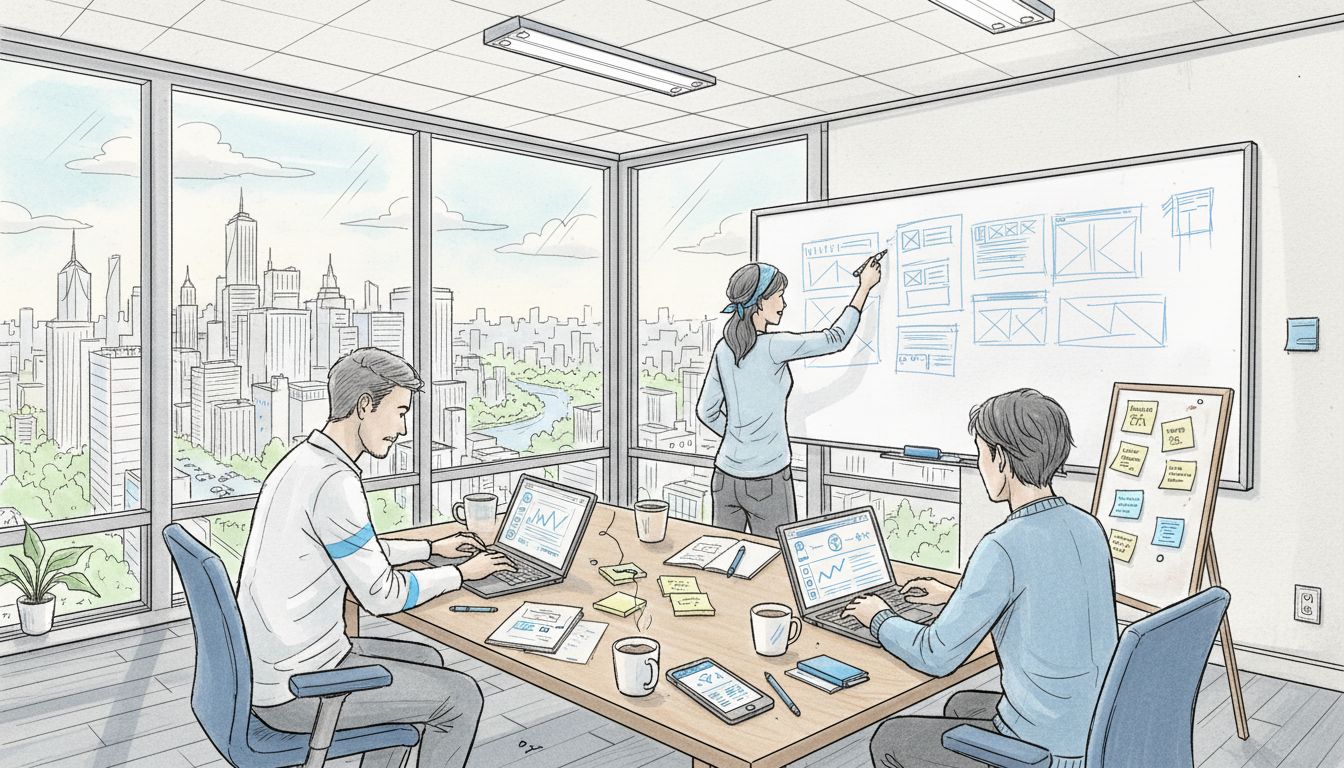
User onboarding friction is the silent killer of SaaS product growth. When new users struggle to understand and navigate your product, they quickly become frustrated and abandon ship.
The consequences are severe. Research involving nearly 700,000 users reveals that complex onboarding processes dramatically reduce trial conversions and long-term user retention. Most SaaS teams mistakenly assume users will invest time learning their product.
Why Onboarding Friction Matters
A complicated signup process or unclear initial user experience can tank your conversion rates. Imagine walking into a store where nothing is labeled, and no one offers help. That’s exactly how users feel with poorly designed onboarding.
Key Strategies to Reduce Friction
- Simplify Initial Steps: Reduce signup form fields to absolute essentials
- Create Clear Guided Pathways: Design intuitive tutorials that show immediate product value
- Personalize the Experience: Use AI-driven customization to tailor onboarding to individual user needs
Successful SaaS products make users feel smart and capable from the first interaction. Your onboarding should feel like a helpful friend guiding them, not an intimidating maze of complexity.
Remember: Users decide whether to continue using your product within minutes of their first interaction. Make those minutes count.
2. Overcomplicating Navigation and Menus
Navigation is the roadmap of your SaaS product. When users can’t quickly find what they need, they get frustrated and are likely to abandon your platform.
Comprehensive digital accessibility research reveals that complicated menus are a primary user experience barrier. Users want simplicity and intuitiveness when exploring a digital product.
The Cost of Complexity
Overwhelming menus create cognitive load. Think of your navigation like a city map. If every street looks similar and signs are confusing, visitors will feel lost. The same principle applies to digital interfaces.
Navigation Best Practices
- Minimize Menu Items: Limit top level navigation to 5-7 core options
- Use Clear Labels: Choose descriptive, straightforward terms users immediately understand
- Maintain Consistency: Ensure predictable menu layouts across all pages
Smart SaaS teams recognize that great navigation feels invisible. Users should find what they want without thinking about how to find it. Your goal is to create a frictionless journey that guides users exactly where they want to go.
Simple navigation isn’t just a design choice. It’s a critical strategy for keeping users engaged and reducing frustration.
3. Neglecting Mobile Responsiveness
In 2023, mobile devices account for over 60% of web traffic. Ignoring mobile responsiveness is like building a storefront that only some customers can enter.
University design systems highlight the critical importance of adaptive design, recommending specific strategies for creating seamless mobile experiences.
Why Mobile Responsiveness Matters
Mobile users have zero patience for websites that don’t work smoothly on their devices. A clunky mobile interface means lost opportunities, reduced engagement, and frustrated potential customers.
Mobile Design Strategies
- Implement Flexible Layouts: Design interfaces that automatically adjust to different screen sizes
- Use Responsive Navigation: Adopt hamburger menus for smaller screens to maximize usable space
- Prioritize Touch Interactions: Create larger tap targets and optimize for touch screen navigation
- Minimize Load Times: Compress images and streamline content for mobile performance
Successful SaaS products treat mobile design as a first class citizen, not an afterthought. Your mobile experience should feel just as polished and professional as your desktop version.
Remember: Mobile isn’t just a screen size. It’s an entire user experience that demands thoughtful, intentional design.
4. Failing to Use Clear Calls to Action
Calls to action are the signposts that guide users through your product. Without them, users wander aimlessly, unsure of what to do next.
Research on mobile application design consistently demonstrates that clear calls to action dramatically improve user engagement and conversion rates.
The Psychology of User Guidance
Users want to be told what to do next. Ambiguity creates friction. When you leave users guessing, they are more likely to become confused and abandon your product.
Crafting Effective Calls to Action
- Be Specific: Use action oriented language like “Start Your Free Trial” instead of vague terms
- Create Visual Hierarchy: Make important buttons stand out with contrasting colors
- Place Strategically: Position calls to action where users naturally look
- Use Compelling Microcopy: Write button text that creates excitement and urgency
Think of calls to action as your product’s GPS. They should clearly show users the fastest route to solving their problem. Great CTAs transform passive browsers into active users.
Remember: A well designed call to action isn’t pushy. It’s helpful. Your goal is to make the next step feel like the most natural thing in the world.
5. Inconsistent Visual Design Language
Visual design language is the silent communicator of your product’s personality. Inconsistent design is like a symphony where every musician plays a different song.
University design systems emphasize the critical importance of maintaining uniform visual elements across digital platforms.
Why Consistency Matters
Inconsistent design creates cognitive friction. When buttons, colors, typography, and interactions change unpredictably, users become confused and frustrated. Your product should feel like one unified experience.
Creating a Cohesive Design Language
- Develop a Design System: Create a comprehensive guide for visual elements
- Standardize Color Palettes: Define primary and secondary color schemes
- Establish Typography Rules: Select consistent fonts and text hierarchies
- Create Reusable Component Libraries: Build a scalable design framework that ensures visual harmony
Think of your design language like a brand’s personality. Every interaction should feel familiar, predictable, and intentional. Consistency builds trust.
Remember: Great design isn’t about making things look good. It’s about creating a seamless, intuitive experience that feels effortless to users.
6. Overlooking Feedback from Real Users
User feedback is the compass that guides product development. Ignore it, and you’ll navigate your SaaS product into irrelevance.
Large scale research on user behavior demonstrates that incorporating real user insights is crucial for understanding product performance and optimizing user experience.
The Hidden Value of User Perspectives
Most teams build products based on assumptions. Great teams build products based on actual user experiences. Feedback reveals blind spots your team cannot see from inside the development bubble.
Effective Feedback Collection Strategies
- Implement Multiple Feedback Channels: Use surveys, interviews, usage analytics
- Create User Communities: Develop platforms where users can share experiences
- Close the Feedback Loop: Show users you’re listening by implementing suggested improvements
- Incentivize Honest Feedback: Offer rewards or recognition for detailed user insights
Think of user feedback as free consulting. Your users are telling you exactly how to make your product better. The most successful SaaS companies treat user insights as a strategic asset.
Remember: Your product exists to solve user problems. The fastest way to understand those problems is to listen to the people experiencing them.
7. Not Streamlining the User Journey
The user journey is your product’s narrative. A fragmented journey means users get lost before discovering your product’s true value.
Digital accessibility experts emphasize the critical importance of creating logical, intuitive pathways that guide users seamlessly through your product.
Understanding User Flow
Users should never feel confused about their next step. Each interaction should feel like a natural progression, with clear signposts and minimal friction.
Strategies for Smooth User Journeys
- Map the Entire User Experience: Document every potential interaction and touchpoint
- Minimize Clicks to Value: Reduce the number of steps required to achieve core product functionality
- Create Predictable Navigation: Design consistent pathways that feel familiar and intuitive
- Provide Multiple Access Routes: Offer alternative ways to complete key tasks
Think of your product as a well designed city. Good infrastructure makes navigation effortless. Users should feel like they are flowing through your product, not fighting against it.
Remember: The best user journeys are invisible. When users stop noticing how they move through your product, you’ve achieved true design excellence.
Below is a comprehensive table summarizing the main challenges and strategies related to SaaS product user experience, as discussed in the article.
| Challenge | Description | Key Strategies |
|---|---|---|
| User Onboarding Friction | Complex onboarding leads to low conversion and retention. | Simplify steps, create guided pathways, personalize experiences. |
| Overcomplicated Navigation | Confusing menus increase cognitive load and frustration. | Minimize menu items, use clear labels, maintain consistency. |
| Neglecting Mobile Responsiveness | Poor mobile design results in lost opportunities and frustration. | Implement flexible layouts, responsive navigation, prioritize touch interactions. |
| Failing to Use Clear Calls to Action | Lack of guidance reduces user engagement and conversion. | Be specific, create visual hierarchy, position strategically. |
| Inconsistent Visual Design Language | Unpredictable design elements cause confusion and frustration. | Develop a design system, standardize colors, establish typography rules. |
| Overlooking Feedback from Real Users | Ignoring feedback stifles product development and improvement. | Implement feedback channels, create user communities, close the feedback loop. |
| Not Streamlining the User Journey | Fragmented journeys lead to user confusion and dissatisfaction. | Map user experience, minimize clicks, design predictable navigation. |
Stop SaaS UX Mistakes From Holding Your Growth Back
The article highlights critical challenges such as onboarding friction, confusing navigation, lack of mobile responsiveness, unclear calls to action, and fragmented user journeys that directly stall your SaaS product’s potential. If you are struggling with inconsistent visual design or missing genuine user feedback, these issues create frustration and drop-offs that slow activation and revenue growth.
At The Good Side Oy, we specialize in turning these exact pain points into seamless, high-performing experiences. Our expert SaaS-focused designers provide strategic UI/UX design, user research, and user journey optimization to help you create clear guided pathways, consistent design languages, and smoother mobile experiences. Don’t let UX mistakes cost you valuable users and conversions.
See how our tailored approach can modernize your product and accelerate growth today. Start with a free design audit to identify hidden UX gaps and get matched quickly with the right specialist for your needs. Take the first step toward a cohesive, engaging SaaS user experience at The Good Side Oy. Learn more about how we help SaaS teams avoid critical UX pitfalls and deliver measurable results by visiting The Good Side Oy.
Frequently Asked Questions
What is user onboarding friction and how can I reduce it?
User onboarding friction refers to the difficulties new users face when navigating your product, which can lead to frustration and abandonment. To reduce it, simplify the initial steps of your signup process and create clear guided pathways that demonstrate immediate product value.
How can I improve navigation in my SaaS product?
Improving navigation involves minimizing menu items and using clear, descriptive labels that users can understand at a glance. Aim to limit top-level options to 5-7 core categories, ensuring consistency in your menu layout across all pages.
Why is mobile responsiveness important for SaaS products?
Mobile responsiveness is crucial because over 60% of web traffic comes from mobile devices, and a poor mobile experience can lead to lost customers. To ensure mobile compatibility, implement flexible layouts and responsive navigation that adapts to different screen sizes and touch interactions.
How can I create effective calls to action in my SaaS product?
To create effective calls to action, use specific, action-oriented language and position buttons where users naturally look. Ensure that important buttons stand out visually and consider placing them strategically to guide users towards desired actions.
What are the best practices for maintaining consistent visual design?
Best practices for maintaining a consistent visual design include developing a design system, standardizing color palettes, and establishing typography rules. Create reusable component libraries to ensure that all visual elements work together seamlessly across your product.
How do I collect and use user feedback effectively?
Collecting user feedback effectively involves implementing multiple channels such as surveys and interviews, and creating communities for user interaction. Actively close the feedback loop by making improvements based on user suggestions, thereby showing users that their insights are valued.