SaaS Website Redesign Workflow for Product Growth
Master a proven saas website redesign workflow to drive product activation, boost user engagement, and achieve measurable business outcomes step by step.

Every major SaaS website redesign starts with a single question: what business result are you truly aiming for? Senior product managers know that chasing a fresher look without clear direction often leads to wasted time and budget. Establishing written sign-off and executive sponsorship before execution ensures every stakeholder pulls in the same direction, gives your objectives teeth, and prevents competing priorities from derailing progress. This approach unlocks redesigns that actually drive activation and sustained user engagement.
Table of Contents
- Step 1: Define Business Goals And Align Key Stakeholders
- Step 2: Map User Journeys And Audit Current Website Experience
- Step 3: Prioritize Redesign Tasks And Set Measurable Kpis
- Step 4: Collaborate On Wireframes And Interactive Prototypes
- Step 5: Implement Design Updates With Cross-Team Alignment
- Step 6: Test And Validate Redesigned Website For Key Outcomes
Quick Summary
| Key Insight | Explanation |
|---|---|
| 1. Align on business goals first | Define clear business outcomes to drive the redesign process, ensuring all stakeholders agree on what success looks like. |
| 2. Map user journeys for insights | Analyze current user interactions to identify friction points, allowing you to focus redesign efforts where they will be most impactful. |
| 3. Prioritize high-impact changes | Focus on redesigning pages and features that directly contribute to your business goals to maximize effectiveness and efficiency. |
| 4. Collaborate through wireframes and prototypes | Use wireframes and interactive prototypes to ensure clarity and agreement among stakeholders, revealing usability issues early in the process. |
| 5. Test thoroughly before launch | Conduct extensive testing across functionality, performance, and usability to ensure the redesigned site meets the intended business outcomes before going live. |
Step 1: Define business goals and align key stakeholders
Before you touch a single design file or sketch out a wireframe, you need absolute clarity on what this redesign will actually accomplish. Not what looks prettier. Not what feels more modern. But what specific business outcome you’re chasing. This is where most redesigns fail—teams dive into execution mode without agreeing on the finish line.
Start by identifying the core business metrics your website redesign must move. Are you trying to increase qualified leads? Reduce customer acquisition cost? Improve onboarding completion rates? Shorten your sales cycle? Get specific with numbers. Business goals translated into OKRs, such as increasing demo requests by 20% or shortening CAC payback from 14 to 10 months, give everyone concrete targets to rally around. These numbers become your north star for every design decision you’ll make. When someone proposes a feature or layout change, you’ll ask: does this move the needle on our goal? If the answer is no, you cut it.
Now bring stakeholders into the room. And I mean actually in the room—synchronously, face-to-face or video call. Schedule structured workshops with your product team, sales leadership, customer success, and engineering. Yes, engineering. They’ll spot technical constraints early that could derail timelines. Your sales team knows which features prospects ask about most. Customer success understands which friction points cause churn. Get their input upfront through structured engagement workshops before decisions are locked in. This isn’t consensus building at its slowest—it’s preventing the project from going sideways three months in because someone important wasn’t heard.
Once you’ve aligned on goals and heard from everyone, document it. Write down your business objectives. Get written sign-off from executive leadership. This sounds bureaucratic, I know, and yes, I learned this the hard way after watching a redesign project pivot twice because priorities shifted. Written commitment keeps the energy from dissipating when competing demands emerge. Assign a single project lead who owns execution accountability and maintains momentum across teams. That person is your quarterback. They track progress, unblock issues, and keep everyone pointed at the same target.
Here’s a summary of key roles and their contributions during a website redesign:
| Stakeholder Group | Unique Contribution | Example Impact |
|---|---|---|
| Product Team | Defines feature requirements | Ensures alignment with vision |
| Sales Leadership | Shares prospect feedback | Highlights asking points |
| Customer Success | Identifies common friction | Reduces user churn |
| Engineering | Spots technical constraints early | Avoids timeline derailments |
| Executive Leadership | Provides strategic sign-off | Keeps project prioritized |
Pro tip: Translate your website redesign goals into specific metrics you can measure weekly, like organic traffic growth or lead form submission rates, so you catch momentum problems before they snowball into bigger issues.
Step 2: Map user journeys and audit current website experience
Now that you know what you want to accomplish, you need to understand how your current website actually performs and where users get stuck. This is detective work. You’re not redesigning yet. You’re observing, documenting, and identifying the friction points that are preventing you from hitting those business goals you just defined. Skip this step and you’ll redesign blindly, potentially fixing the wrong problems or creating new ones.
Start by mapping the actual paths your users take through your website. Who are your primary user personas? For a product-focused SaaS company, you might have technical buyers, executive sponsors, and implementation teams all coming to your site with different questions and goals. Each one follows a different path. A technical buyer might land on your features page and dive deep into integrations. An executive sponsor might jump straight to ROI case studies. An implementation team might head to your documentation or resource center. Understanding how different users navigate your website means you stop building one generic experience and start building multiple smart pathways. Map these journeys out visually. Use flowcharts, sketches, or digital tools. Include entry points, key pages, decision moments, and exit points. Where do people drop off? Where do they get confused? This becomes your baseline.

With those journeys mapped, conduct a thorough audit of your current website experience. This isn’t about aesthetics. You’re looking for functional problems. Test the actual user experience yourself. Click through the flows. Try to complete a key action like requesting a demo or signing up for a trial. Note every friction point. Is your call to action button buried below the fold? Are form fields asking for information you don’t need? Does your pricing page make it impossible to understand what you actually charge? Do your navigation and content hierarchy make sense, or do users have to hunt for answers? Understanding the essential types of UX audits helps you know exactly what to measure. Document performance data too. Check your analytics. Where does your traffic come from? What pages have the highest bounce rates? Which pages convert best? What’s your typical time on site? These metrics reveal where your website is working and where it’s failing.
Collect feedback directly from users. Run moderated user tests with 5 to 8 people from each key persona group. Watch them use your site without guidance. Let them talk out loud about what they’re trying to do and what’s confusing. You’ll spot problems you never would have noticed internally. Supplement this with surveys or interviews asking customers and prospects what they found frustrating about finding information or taking action on your site. Then synthesize everything. Create a findings document that outlines your biggest friction points, ranked by severity and impact on your business goals. This becomes the roadmap for your redesign.
Pro tip: Record and timestamp your user testing sessions so designers and product managers can watch the actual moments of confusion rather than relying on secondhand descriptions, which loses critical context and emotion.
Step 3: Prioritize redesign tasks and set measurable KPIs
You’ve identified where users struggle and what business outcomes matter. Now you need to decide what to actually build first. A full website redesign is massive. You can’t do everything at once without blowing your timeline and budget. The teams that win are the ones who focus ruthlessly on high-impact changes and ignore everything else. This is where strategic thinking separates a successful redesign from an expensive redesign that moves no needles.
Start by identifying which pages and features will have the biggest impact on your business goals. If your goal is to increase demo requests, your signup flow, pricing page, and main CTA placements matter infinitely more than your blog template. If you’re reducing customer acquisition cost, your CTAs and conversion pathways are critical. If you’re improving activation, your onboarding experience and feature discovery are the priority. A focused website redesign strategy defines clear phases starting with high-impact pages like pricing and signup, which means you protect revenue-driving elements while improving speed, mobile usability, and messaging. Map out your page hierarchy. Which pages get the most traffic? Which have the highest conversion rates currently? Which have the worst bounce rates? These are your power players. Redesign them first. Secondary pages and nice-to-have improvements go into a backlog for phase two or beyond. This isn’t about perfectionism. It’s about velocity and return on investment. You want to ship something that moves the dial fast.
Now define the exact metrics you’ll use to measure success. This is non-negotiable. You can’t know if your redesign worked without baseline numbers and clear targets. Setting measurable KPIs for your website redesign ensures alignment and performance tracking across your team. Start with the metrics directly tied to your business goals. If you want 20 percent more demo requests, that’s your primary KPI. But supplement that with supporting metrics. Track conversion rates for key CTAs. Monitor bounce rates on priority pages. Measure session duration and page views per session. Watch your organic search traffic and keyword rankings because redesigns can accidentally kill your SEO if you’re not careful with redirect mapping. Monitor page loading speed and mobile performance. Check heatmaps and user feedback to understand how people actually interact with the new design. Cost per lead and customer acquisition cost matter too. You want to see leads come in faster and cheaper, not just more volume with worse quality.
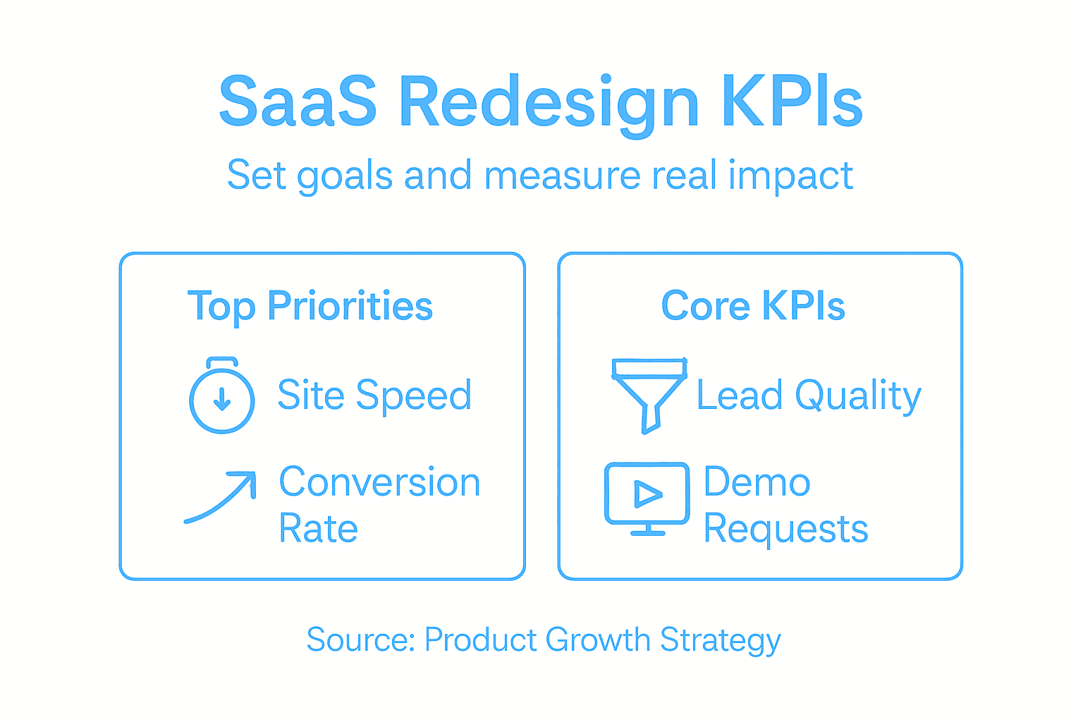
Set specific numeric targets for each metric before you launch. Don’t say “improve conversion rates.” Say “increase demo request conversion from 3.2 percent to 4.1 percent within 60 days of launch.” Assign someone to track these metrics religiously starting day one after launch. Build a dashboard everyone can see. Review it weekly. When metrics move in the wrong direction, catch it early and diagnose why. This post-launch monitoring phase is where most redesigns fail because teams celebrate launch day and stop paying attention. Your redesign isn’t done when the site goes live. It’s done when you’ve proven you moved the needle on what matters.
Pro tip: Set up your KPI tracking and analytics before you launch the redesigned site so you capture accurate baseline data from day one, rather than trying to retroactively piece together what changed and why.
Step 4: Collaborate on wireframes and interactive prototypes
This is where your vision becomes concrete. Wireframes and interactive prototypes transform abstract ideas and stakeholder opinions into something everyone can actually see and use. They force clarity. When people can click through a flow or see where elements sit on a page, disagreements disappear and real problems surface. Without prototypes, you’re having conversations about concepts. With them, you’re making decisions based on evidence.
Start by creating low-fidelity wireframes for your priority pages. Don’t worry about polish. Wireframes aren’t about design. They’re about structure and flow. Sketch out where your header goes, where your main CTA sits, how your form fields are organized, where your social proof lives. Get the information architecture right first. Use a cloud-based platform that lets your entire team collaborate simultaneously rather than sending files back and forth. Real-time collaborative editing with drag-and-drop interfaces enables SaaS teams to iterate fast and gather stakeholder feedback without bottlenecks. Your product manager can move a CTA and see the impact immediately. Your engineer can flag technical constraints. Your content person can size up where copy needs to fit. Everyone works together instead of sequentially.
Once wireframes are locked, build interactive prototypes. This means creating clickable flows that simulate how users actually move through your product. Someone lands on your pricing page. They click a button. They get taken to the signup flow. They fill out a form. They see a confirmation screen. This interactive prototype should feel like using a real product, minus the polish. When you test these prototypes with users or stakeholders, you catch usability problems before engineering builds anything. You discover that your form is confusing. Your CTAs aren’t obvious. Your workflow doesn’t match how people actually think. These insights are gold. Fixing them in a prototype takes hours. Fixing them in code takes days or weeks.
Facilitate structured feedback sessions around your prototypes. Don’t just ship a link and ask people to comment. Schedule actual review meetings. Watch people interact with your prototype. Ask them to think out loud about what’s confusing. Ask them what they expected to happen when they clicked a button. Document everything. Use an annotation tool so people can leave comments directly on the prototype. Create a feedback synthesis document that categorizes comments into “must fix,” “nice to have,” and “disagree.” The must-fixes get incorporated immediately. The nice-to-haves go into phase two. The disagree items get debated briefly and decided by your product lead. This prevents endless iteration where feedback accumulates without resolution.
As you refine prototypes, maintain a living version that represents your current direction. Don’t create a new prototype every week. Build one that evolves. This gives your team a single source of truth. Everyone knows where to look. Everyone sees the latest thinking. When executives ask “what’s the redesign looking like,” you show them the current prototype. When engineering is ready to start building, they reference the prototype. It becomes your shared language.
Pro tip: Test your interactive prototypes with 3 to 5 real users from your target audience before you hand designs to engineering, because prototype feedback is 10 times cheaper to implement than feedback after development begins.
Step 5: Implement design updates with cross-team alignment
You have prototypes locked. You have buy-in from stakeholders. Now comes the messy part: actually building it. This is where most redesigns derail. Design hands off to engineering. Marketing creates their own messaging. Product makes different assumptions about how features should work. Six months later, the site launches with inconsistencies, technical debt, and features that don’t work as intended. You avoid this catastrophe by keeping teams synchronized throughout implementation, not just at the beginning.
Start with annotated handoff documentation. Your designers shouldn’t just hand over high-fidelity comps and expect engineers to figure it out. Document the decisions behind every element. Why does this CTA sit here? What happens when someone clicks it? What’s the fallback behavior if something breaks? What’s the responsive behavior on mobile? Annotated wireframes and design specs document expectations for content, UI, and development teams, facilitating asynchronous collaboration across disciplines. Your design tool should have annotation capabilities built in. Add comments directly on components explaining technical requirements, content expectations, and edge cases. This prevents engineers from building something that looks right but behaves wrong. Create a shared component library or design system so everyone’s building with the same UI elements. When marketing writes copy, they know it fits the space you’ve allocated. When engineering builds a form, they know the validation states. When product decides to add a feature, they know what components exist and can be reused. This eliminates rediscovery and rework.
Establish a clear implementation timeline with phased rollouts. Don’t launch everything simultaneously. Roll out your most critical pages and features first. Measure how they perform. Fix issues. Then roll out the next wave. This staged approach catches problems before they cascade through your entire website. It also gives your team breathing room to handle the inevitable last-minute issues that pop up. Schedule weekly sync meetings with representatives from design, engineering, marketing, and product. Fifteen minutes, standing agenda. What’s complete? What’s blocked? What changed since we last met? These synchronous check-ins catch alignment problems before they balloon into bigger issues. Someone on the marketing team discovers that the copy doesn’t fit the space the designer allocated. You catch it in the meeting and fix it before engineering builds it. Transparent communication and iterative review cycles help catch issues early, while project leaders coordinate priorities to avoid silos.
Create a shared tracking document everyone can see. This might be a Jira board, a Notion page, or a simple Google Sheet. Everyone knows what’s in progress, what’s blocked, what’s ready to launch. No surprises. No wondering why something hasn’t started. No duplicate work. As you implement, maintain the single source of truth prototype you built earlier. Don’t let it get stale. Update it as the real implementation diverges from the original plan. When someone asks what the design looks like or why a decision was made, you point them to the prototype with its annotations. It becomes your institutional memory. By launch day, your entire team moves as one organism instead of separate departments pushing in different directions.
Pro tip: Lock design decisions at least two weeks before engineering completes a feature, so engineers have time to build it, test it, find problems, and escalate issues before launch instead of discovering them the day before launch goes live.
Step 6: Test and validate redesigned website for key outcomes
Your redesigned site is built. It looks good. Everyone’s excited. But you haven’t actually verified that it works. Not just technically, but that it delivers the business outcomes you set out to achieve. This is the moment where assumptions meet reality. You test thoroughly before launch, or you launch broken and spend weeks firefighting problems. The choice is yours.
Start with comprehensive functional testing. Your site needs to work flawlessly across every browser, device, and operating system your users access it from. Test on Chrome, Safari, Firefox, and Edge on desktop. Test on Safari and Chrome on iOS and Android. Test on tablets. Test on different screen sizes and orientations. Every button should work. Every form should submit. Every link should go somewhere. Test the actual user flows you mapped out earlier. Someone lands on your homepage, clicks the pricing CTA, fills out the signup form, and confirms their email. Walk through that entire journey. Then test the edge cases. What happens if someone submits a form with invalid data? What if they click the back button mid-transaction? What if they have JavaScript disabled? Comprehensive validation of functionality, performance, security, and usability before production release ensures your redesigned website maintains stability and a seamless user experience. Use automated testing to catch obvious breaks and manual testing to catch the weird edge cases that automation misses. Automate the stuff that’s repetitive. Do the thinking yourself.
Performance matters enormously. A beautiful redesigned site that loads in 8 seconds is worse than a mediocre site that loads in 2 seconds. People leave slow sites. Search engines rank them lower. Your conversion rates tank. Test your page load times under real conditions. Not in your office on a fast connection. Test from real worldwide locations. Test with throttled connections simulating what someone on a slower network actually experiences. Measure your Core Web Vitals. Largest Contentful Paint, First Input Delay, Cumulative Layout Shift. These aren’t academic metrics. They directly impact how users perceive your site and how Google ranks you. If your redesign broke your page speed, fix it before launch. Conduct security testing too. Make sure you haven’t introduced vulnerabilities that expose user data or create backdoors for attackers. And test compatibility across your entire ecosystem. If you have integrations with CRM systems or payment processors, test those. If your site relies on third-party services, test those integrations. One broken connection can cascade into broken user flows.
Run usability testing with real users from your target audience. Have 5 to 8 people use your redesigned site and complete key tasks. Do they find what they’re looking for? Can they complete a signup without getting confused? Do they understand your pricing? Do the CTAs make sense? Automated and manual testing approaches should be integrated to enable fast, reliable deployment cycles alongside user feedback validation before launch. Watch where people struggle. Document the problems. If multiple people get stuck on the same thing, it’s a real problem. Fix it. After usability testing, measure your redesigned site against your KPIs. Did conversion rates improve? Are bounce rates lower? Is session duration higher? Is organic traffic stable or growing? If your metrics moved in the wrong direction, you need to understand why before you declare victory. Did the redesign actually cause the problem, or was it external factors? Keep testing post-launch too. Your job doesn’t end the day the new site goes live. Monitor performance. Watch user behavior. Collect feedback. When you spot issues, fix them quickly. The teams that win continuously iterate based on what the data tells them, not what they hoped would happen.
Below is a quick comparison of testing types crucial before and after a website redesign:
| Testing Type | Main Purpose | When Used |
|---|---|---|
| Functional Testing | Check all features work correctly | Pre-launch and post-launch |
| Performance Testing | Ensure quick load times and speed | Pre-launch |
| Usability Testing | Validate site is clear for users | Pre-launch and post-launch |
| Security Testing | Confirm data is protected | Pre-launch |
| Integration Testing | Test connections to other systems | Pre-launch |
Pro tip: Run a staged rollout to 10 percent of your traffic first and monitor your KPIs for 48 hours before pushing the redesign to everyone, so you catch critical problems affecting real users before they cascade to your entire audience.
Accelerate Your SaaS Website Redesign With Expert Design Leadership
Redesigning a SaaS website to drive product growth is complex and requires clear business goals, precise user journey mapping, and tight cross-team collaboration. This article highlights the common challenges of aligning stakeholders on measurable KPIs, testing prototypes effectively, and implementing design updates without costly delays or miscommunication. If you have felt the frustration of redesigns that fail to move the needle or the pressure of juggling too many priorities without clear direction, you are not alone.
At The Good Side, we specialize in embedding senior design leadership directly within your product and engineering teams to overcome these exact obstacles. Our outcome-driven designers bring SaaS-specific expertise to strategically co-create onboarding, product design, and go-to-market experiences that improve activation and long-term revenue impact. We help SaaS companies translate vague redesign goals into measurable progress while keeping cross-functional teams aligned during wireframing, prototyping, implementation, and testing phases.
Stop wasting time on surface-level UI fixes and get the strategic design partnership that drives real business outcomes. Visit The Good Side now to learn how our flexible fractional design engagements can accelerate your SaaS website redesign and product growth journey.
Frequently Asked Questions
What are the first steps in a SaaS website redesign?
Start by clearly defining your business goals and aligning key stakeholders. Identify specific metrics you want to impact, such as increasing demo requests by 20% or reducing customer acquisition costs by 25%.
How can I identify user friction points during the redesign?
Map user journeys to understand how different personas navigate your website. Conduct usability testing with real users to observe where they encounter difficulties and document these friction points for improvement.
What metrics should I track to measure the success of my website redesign?
Establish clear key performance indicators (KPIs) that align with your business goals, such as increasing conversion rates or reducing bounce rates. Monitor these metrics weekly to ensure you’re on track to achieve your objectives, adjusting your strategy as necessary.
How do I prioritize tasks during the redesign process?
Focus on high-impact pages and features that directly contribute to your business goals, like the signup flow or pricing page. Create a roadmap that prioritizes these elements to ensure efficient use of resources and timely delivery.
What steps should I take to validate my redesigned website before launch?
Conduct thorough functional, usability, and performance testing with diverse browsers and devices. Implement a staged rollout to a small percentage of your audience first, monitoring key metrics for 48 hours to catch any critical problems before full launch.