Design for SaaS: Driving Activation and Growth
Design for SaaS shapes intuitive user journeys, drives onboarding, and boosts long-term activation. Explore principles, types, processes, and pitfalls.

Every SaaS leader knows the stakes are higher when users can leave with a single click. Designing for SaaS means building for continuous engagement, balancing first impressions with long-term retention across cloud-based, subscription-driven platforms. This matters because your interface shapes daily behavior and revenue at scale. Discover how continuous engagement and purposeful design unlock better user activation and lasting satisfaction for ambitious SaaS teams worldwide.
Table of Contents
- Defining Design for SaaS Products
- Key Types of SaaS Design Work
- Principles Guiding Effective SaaS Design
- How Design Impacts Activation and Retention
- Common Pitfalls and How to Avoid Them
Key Takeaways
| Point | Details |
|---|---|
| Continuous Engagement Focus | Design for SaaS must prioritize ongoing user interaction rather than just initial adoption. |
| User-Centric Design Principles | Understand user needs deeply to create intuitive experiences that enhance usability and satisfaction. |
| Iterative Design Approach | Embrace continuous improvement and iteration, as user needs and product dynamics evolve over time. |
| Activation and Retention Importance | Design choices significantly impact user activation and retention; prioritize smooth onboarding and clear navigation. |
Defining Design for SaaS Products
Design for SaaS products is fundamentally different from designing traditional software. A SaaS product runs on cloud infrastructure, operates on a subscription model, and gets accessed by users across multiple devices and locations. This changes everything about how you approach design. You’re not shipping a one-time product to customers who own it outright. You’re building an ongoing experience that users interact with repeatedly, often daily, and they can cancel at any moment. That changes your priorities. The design needs to balance immediate first impressions with long-term retention, intuitive onboarding with powerful functionality, and visual polish with underlying performance. When companies design for SaaS, they’re designing for continuous engagement, not just one-time adoption.
At its core, design for SaaS focuses on seamless user experiences across cloud-based platforms that are accessible through various touchpoints, with special emphasis on usability, customer satisfaction, and scalability. But what does that actually mean in practice? It means your design decisions need to accommodate diverse users with different skill levels, workflows, and goals. A CFO and a junior accountant shouldn’t require entirely different products, but they need paths through your product that make sense for their specific roles. It means your interface must remain intuitive whether someone accesses it on a desktop during a 9-to-5 workday or on a mobile device at 11 PM while traveling. It means every feature you add needs to scale without overwhelming new users or slowing down power users.
The design work itself comprises two interconnected domains: user interface (UI) and user experience (UX). UI covers the visual and interactive elements you see on screen—buttons, navigation patterns, typography, color systems, form layouts. UX encompasses the entire journey someone takes through your product, from the moment they sign up through their first successful task, their daily workflows, and eventually their decision to upgrade or expand. Both matter equally. A beautifully designed interface that leads users down a confusing path isn’t good design. An intelligently structured experience buried behind clunky, unclear UI won’t drive adoption either. This is why creating user interfaces and experiences that prioritize simplicity and clarity matters so much for SaaS success—your design needs to be both beautiful and functional, a quality that separates products people want to use from products people tolerate.
What makes SaaS design particularly challenging is the subscription context. Users aren’t captive. They’re making a conscious decision every month to continue paying for your product. That means every interaction needs to deliver value quickly and clearly. Your onboarding experience can’t be a 20-step tutorial. Your navigation can’t be buried three levels deep. Your core value proposition needs to be visible from your first screen. This drives design decisions around progressive disclosure, clear hierarchy, and thoughtful feature prioritization. You’re designing for users who are actively evaluating whether your product deserves their attention and their budget.
Pro tip: Start by mapping your user’s first 10 minutes in your product—from signup through their first meaningful action—and ruthlessly simplify every interaction. If you can’t explain why a step exists in that onboarding flow, remove it.
Key Types of SaaS Design Work
SaaS design work isn’t monolithic. It breaks down into distinct disciplines, each addressing different aspects of the product experience. Understanding these disciplines matters because they require different skills, different approaches, and different success metrics. When you’re building a SaaS product, you’re not just hiring one designer and expecting them to handle everything. You need designers thinking about different problems simultaneously. The most common categories include user experience design, user interface design, product design, service design, and increasingly, business design. Each one shapes how users perceive and interact with your product, but they operate at different levels of abstraction. Get the hierarchy right, and everything else becomes easier. Get it wrong, and you end up with beautiful interfaces that don’t solve problems or intuitive workflows trapped in confusing visual design.
User experience design focuses on the overall journey users take through your product. This includes user journey mapping, wireframing, and prototyping to understand how people move from signing up through completing their core tasks and achieving their goals. A UX designer asks questions like: Where does a user get stuck? What information do they need at each step? Are they taking the most efficient path, or are we making them work harder than necessary? UX designers conduct user research, synthesize findings into actionable insights, and create flows that minimize friction. User interface design, by contrast, handles the visual language and interactive elements. UI designers decide on color systems, typography, button styles, icon design, form layouts, and micro-interactions. They ensure that every interactive element feels responsive, looks professional, and clearly communicates what happens when you interact with it. The best products have strong partnerships between UX and UI designers. UX defines the logical structure and flow. UI brings that structure to life visually and ensures every element reinforces the experience UX designed.
Product design sits at the intersection of user needs, business goals, and technical feasibility. Product designers make decisions about which features to build, how to prioritize them, and how to sequence them into coherent product releases. They operate using iterative processes that include empathizing with users, defining problems, ideating solutions, prototyping, and testing with real users. This human-centered approach ensures that every feature you build actually addresses real user needs rather than solving problems that exist only in stakeholder imagination. Service design takes a broader perspective still. Where product design focuses on the digital product itself, service design thinks about the entire customer journey across all touchpoints—website, email communications, onboarding documents, support experiences, billing interactions, and the product itself. A service designer ensures consistency across these experiences and designs for moments that happen outside your application. Business design looks even further outward, examining your business model, pricing strategy, go-to-market approach, and customer segmentation. These disciplines overlap constantly, and in growth-stage SaaS companies, designers often wear multiple hats.
Here is a comparison of key SaaS design disciplines and their primary responsibilities:
| Design Discipline | Core Focus | Key Responsibilities |
|---|---|---|
| UX Design | User journey and flow | Journey mapping, wireframes, prototyping |
| UI Design | Visual elements and interaction | Color systems, icons, consistency |
| Product Design | Feature prioritization | Balancing user needs, business goals |
| Service Design | End-to-end customer experience | Consistency across all touchpoints |
| Business Design | Business model and strategy | Pricing, go-to-market, segmentation |
What’s critical to understand is that all these design disciplines must work toward the same goal: driving activation and retention. You can have a perfectly designed user interface, but if the overall product experience doesn’t solve a real problem, users won’t activate. You can have a brilliant product strategy, but if the interface confuses users, they’ll churn. You can have an excellent onboarding flow, but if the business model doesn’t align with customer expectations, they’ll resent you. The design work that matters most is the work where these disciplines talk to each other, align on priorities, and make trade-offs together. In practice, this means your design team needs alignment on user personas, success metrics, and the problems you’re trying to solve. It also means you need the right level of rigor for your stage. Early-stage companies often can’t afford separate UX and UI designers. But you need someone thinking about both. Late-stage companies might have dedicated service designers and business designers working alongside product designers. The size of the team matters less than the intentionality of the work.
Pro tip: Start by mapping which types of design work directly impact your activation metric—typically your most critical metric at growth stage—and invest your design resources there first, rather than spreading effort across all disciplines equally.
Principles Guiding Effective SaaS Design
Effective SaaS design isn’t about making something look pretty. It’s about making something work. The difference matters enormously. You can have a gorgeous interface that frustrates users daily, or a utilitarian layout that people love using because it solves their problem efficiently. The principles that guide the best SaaS design focus on this fundamental distinction. They prioritize user outcomes over aesthetic preferences. They recognize that your users are paying monthly for your product, which means every interaction needs to justify its existence. They understand that your product will scale, which means decisions you make today need to hold up when you have 10,000 users instead of 100. Start with clarity. Effective SaaS design emphasizes simplicity and clear interface hierarchy, which reduces cognitive load and helps users find what they need without friction. Your navigation shouldn’t be creative. It should be obvious. Your core features shouldn’t be buried behind clever metaphors. They should be visible on the first screen. Your form fields shouldn’t require users to think about what information you’re asking for. The label should make it instantly clear. This principle sounds simple, but it’s surprisingly difficult to execute once you have 50 features instead of 5 and stakeholders all lobbying to highlight their part of the product.

The second foundational principle is understanding your users deeply before you design for them. This means starting with clear problem and user understanding before launching into solutions. You need to know who you’re designing for specifically. Not “business users.” Specifically: a VP of Sales at a 50-person SaaS company running quota-based teams, or a Customer Success Manager at a 500-person software company managing churn risk. These are entirely different people with entirely different workflows. What works for one might confuse the other. The best SaaS products aren’t designed for everyone. They’re designed brilliantly for someone specific, and then they accommodate secondary users around that core experience. This principle extends beyond personas. You need to understand the context where users interact with your product. Are they using it during focused work sessions or stolen moments between meetings? Are they power users who log in daily or occasional users who might visit monthly? Are they decision makers, implementers, or both? These contextual factors shape every design decision you make, from information density to tutorial depth to feature visibility.
A third principle is embracing iterative evolution. SaaS products aren’t finished. They change constantly. Your design system needs to support that change without requiring you to redesign everything whenever you add a feature. This means building scalable design foundations that can accommodate new functionality without becoming chaotic. It means designing in systems rather than pages. Instead of designing a specific dashboard, you design dashboard components that can be combined in different ways. Instead of designing a form, you design form components and patterns that work consistently everywhere. This approach requires more upfront rigor, but it pays dividends as your product scales. It also means accepting that you’ll continuously improve your product based on user behavior and feedback. You’re not trying to ship a perfect product. You’re building a product that gets better every month. The design decisions you make should reflect that reality.
The final principle is balancing complexity with accessibility. SaaS products often need to do sophisticated things. Spreadsheets are complex. Marketing automation platforms are complex. Financial modeling tools are complex. The design challenge isn’t making these things simple—that’s impossible. It’s making complex things learnable and usable. This means progressive disclosure, where you show users what they need right now and let them discover advanced options when they’re ready. It means thoughtful onboarding that teaches users your mental model rather than overwhelming them with features. It means consistent patterns, so users can transfer learning from one part of your product to another. It means supporting both novice and expert users—the novice needs hand-holding; the expert needs speed and keyboard shortcuts. The goal isn’t to dumb down your product. It’s to respect your users’ intelligence while acknowledging that they’re learning your specific system for the first time.
Pro tip: Before designing anything new, write down the one core problem you’re solving and the one specific user persona you’re solving it for, then test every design decision against that constraint—if a feature or interaction doesn’t serve that core problem for that specific user, question whether it belongs in the design.
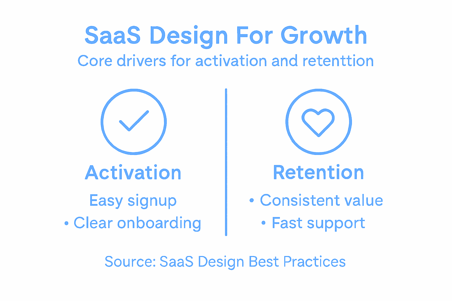
How Design Impacts Activation and Retention
Design directly controls whether users activate or bounce. This isn’t philosophical. It’s measurable and concrete. A user signs up for your product. They land on your dashboard. They either understand immediately what to do next, or they don’t. If they understand, they might complete their first meaningful action. If they don’t, they’ll close the tab and try a competitor. That first moment is where design either works or fails. The quality of your onboarding flow, the clarity of your interface, the prominence of your core value proposition—all of these are design decisions. All of them impact whether someone becomes an active user or a churned signup. Most SaaS companies measure activation as a specific action: a user completing their first successful task, inviting a team member, connecting their first data source, or running their first report. Whatever that action is, it’s a design problem to solve. You need to get users from signup to that action as quickly and as smoothly as possible. Every friction point along that path is costing you activations.
The activation funnel is where design has the most concentrated impact. Consider the typical steps: signup, email verification, product setup, first task completion. Each of these steps is an opportunity to lose users. A signup form that asks for too much information loses users. An email verification that requires checking spam folders loses users. A setup wizard that’s unclear about what information you’re asking for loses users. A first task that requires 10 steps to complete loses users. Understanding the role of UX in activation reveals that small design improvements compound across these steps. If your signup form reduces abandonment by 10 percent, your onboarding reduces friction by 15 percent, and your first task path becomes 20 percent clearer, you’re looking at a potential 40 percent improvement in activation rates. That’s not incremental. That’s transformational. And it all comes from design work. The key is recognizing that activation isn’t a single moment. It’s a series of decisions and interactions, each one shaped by design. Most companies focus on making their product beautiful once users are inside. The best companies focus on making the path to first value as smooth as possible.
Retention is where design’s impact becomes even more apparent. A user activates. They use your product a few times. They either keep coming back or they don’t. The difference between a retained user and a churned user is almost always tied to design decisions. Did you make it easy for them to accomplish their second task? Did you recognize their progress and celebrate it? Did you make it obvious how to upgrade when they hit limits? Did you show them features that solve new problems as their needs evolved? Or did you leave them confused about what to do next, assuming they’d figure it out? Retention compounds. A user who completes their first task within three hours is dramatically more likely to return next week. A user who completes their first task after three days is significantly more likely to churn. Design controls that timeline. Why design drives SaaS growth and retention becomes obvious when you look at retained users versus churned users. The retained users consistently report that the product was intuitive. They got value quickly. The interface never confused them. The churned users consistently report that they couldn’t figure out how to do what they wanted. They didn’t understand the workflow. They didn’t see how to accomplish their goals efficiently.
The mechanism is simple: good design makes users successful faster. Bad design makes them unsuccessful. Success breeds engagement. Failure breeds churn. This is why the most successful SaaS companies obsess over onboarding and feature discovery. They recognize that a user’s willingness to stay hinges on whether they can accomplish meaningful work in your product. Your job as a design leader is to obsess over removing every obstacle between signup and first value, and then between first value and ongoing success. This means instrumenting your product to understand where users drop off. It means running tests to validate that your design changes actually reduce friction. It means listening to users who churned to understand what broke for them. It means treating activation and retention as design problems, not as metrics you hope will improve. When you do this, you unlock the compounding power of design. A 5 percent improvement in activation and a 5 percent improvement in retention doesn’t feel like much. But over a year, with monthly recurring revenue, it transforms your unit economics entirely.
This table summarizes how design choices impact key SaaS business metrics:
| Design Decision | Impact on Activation | Impact on Retention |
|---|---|---|
| Clear onboarding | Faster first task, higher signup completion | Users return confidently, less churn |
| Intuitive UI | Reduces drop-off during setup | Boosts daily usage, builds loyalty |
| Scalable features | Smooth experience at all user levels | Supports growth without confusion |
| Contextual help | Minimizes confusion in early use | Enables advanced adoption over time |
Pro tip: Map your activation funnel step by step, identify the step with the highest abandonment rate, and focus your next design sprint entirely on reducing friction at that single step—don’t try to improve everything at once, because small, focused improvements beat broad attempts at redesign.
Common Pitfalls and How to Avoid Them
Most SaaS design failures follow predictable patterns. They’re not failures of creativity or ambition. They’re failures of discipline. Teams skip steps they should follow, take shortcuts they shouldn’t, and optimize for the wrong metrics. Learning to recognize these pitfalls before you hit them can save months of wasted effort and millions in lost revenue. The first major pitfall is designing without sufficient user research. You might think you know what your users need. You might be confident that your intuition is correct. Then you talk to actual users and realize you’ve been wrong. Neglecting thorough user research leads to designing features no one wants, which is expensive and demoralizing. The fix sounds simple: talk to users before you design. But it requires discipline. It requires budgeting time for research that feels like it’s slowing you down. It requires accepting that your ideas might be wrong. The teams that do this consistently ship products that activate faster and retain better. The teams that skip this step ship products that look beautiful and go nowhere.
A second critical pitfall is creating interfaces that try to do too much. You’ve built 50 features. They’re all valuable. They’re all solving real problems. So you put them all on the dashboard. Users land on your product and see a wall of complexity. They don’t know where to start. They don’t know what’s important. They close the tab. Overloading interfaces with too many features without clear hierarchy is one of the fastest ways to kill activation rates. The fix requires making hard choices. What’s the one thing a new user needs to accomplish first? What features matter for that specific moment? Hide everything else. Let users discover advanced features gradually as they become comfortable with your product. This goes against the impulse to showcase everything you’ve built, but it’s what works. You’re not hiding features permanently. You’re just respecting the user’s cognitive load and showing them what matters right now.
A third pitfall is treating design thinking as a linear process that ends with launch. You research, you design, you test, you ship. Done. Except it’s never done. Your users’ needs evolve. Your product changes. Your competition evolves. The design work that worked brilliantly on day one might be wrong six months later. The teams that recognize this embrace continuous iteration. They instrument their product to understand how users actually behave. They run small tests to validate improvements before rolling them out. They listen to churned users to understand what broke. They treat design as something that improves every week, not something that’s finished after the initial design sprint. Most companies do the opposite. They design, launch, and then ignore design until something breaks badly enough that leadership finally allocates resources to fix it. That’s expensive. Continuous iteration costs less and gets you better results.
A fourth pitfall is poor onboarding experiences. You’ve nailed your product. Your core experience is brilliant. But new users never get there because the onboarding is confusing, unclear, or too long. Onboarding is where most users form their first impression of your product. It’s where activation happens or fails. Too many teams treat onboarding as an afterthought, something to bolt on once the core product is done. The best teams treat it as core product work. They understand that onboarding is how you communicate your product’s value proposition. It’s how you teach users your mental model. It’s how you get them to their first success as quickly as possible. Bad onboarding can kill a great product. Good onboarding can make an average product feel brilliant.
The final pitfall is designing for the moment rather than for scale. You’re building for 100 users today. Your design works fine at that scale. But what happens when you have 1,000 users? What if you have 10,000? Will your dashboard still work? Will your navigation still make sense? Will your design system support the new features you need to add? Teams that design for scale from the beginning move faster later. Teams that optimize for today’s problem often have to rebuild everything when they get successful. This doesn’t mean overengineering everything. It means thinking about what could break as you scale, and making strategic decisions now that prevent catastrophe later.
Pro tip: Create a design audit checklist of these five pitfalls and review your product against it quarterly—if you catch yourself sliding into any of these patterns, pause and reallocate design time to fix it before it becomes a bigger problem.
Elevate Your SaaS Product Design to Drive Activation and Growth
The challenges of designing for SaaS highlighted in this article resonate deeply with growth-focused companies struggling to convert signups into active, retained users. Complex onboarding, unclear interfaces, and the need for scalable, user-centered design are common barriers to activation and long-term revenue. If your team is facing these pain points and seeking to embed strategic design leadership that aligns user experience with business goals, The Good Side Oy offers exactly that expertise. We specialize in partnering with established SaaS companies to embed senior designers who co-create solutions focused on improving activation, simplifying onboarding, and driving retention through intentional, outcome-driven design.
Take your SaaS product beyond surface-level UI fixes with a fractional design partner who understands the nuances of SaaS growth. Our designers integrate directly into your workflows to help you identify and remove friction points in the activation funnel and build scalable experiences that users love. There is no better moment than now to accelerate your product’s growth. Discover how we bring hands-on design leadership combined with SaaS-specific insight that transforms your product and customer journey by visiting The Good Side Oy and start making better product decisions faster.
Frequently Asked Questions
How does design affect user activation in SaaS products?
Design directly influences user activation by creating clear and intuitive onboarding experiences. A streamlined interface helps users understand what to do next, leading to quicker completion of their first meaningful action within the product.
What are the main design disciplines relevant to SaaS?
The main design disciplines for SaaS include user experience (UX) design, user interface (UI) design, product design, service design, and business design. Each focuses on different aspects of user interaction and product strategy to enhance overall effectiveness.
Why is iterative design important for SaaS growth?
Iterative design is crucial because SaaS products must evolve based on user behavior and feedback. This continuous improvement helps address changing user needs and keeps the product relevant and efficient, ultimately reducing churn and improving retention rates.
What common mistakes should designers avoid when creating SaaS products?
Common mistakes include neglecting user research, overloading interfaces with too many features, overlooking the importance of onboarding, and not designing for scalability. Avoiding these pitfalls can lead to more effective design and better user experiences.