
Importance of Responsive Design in SaaS Growth
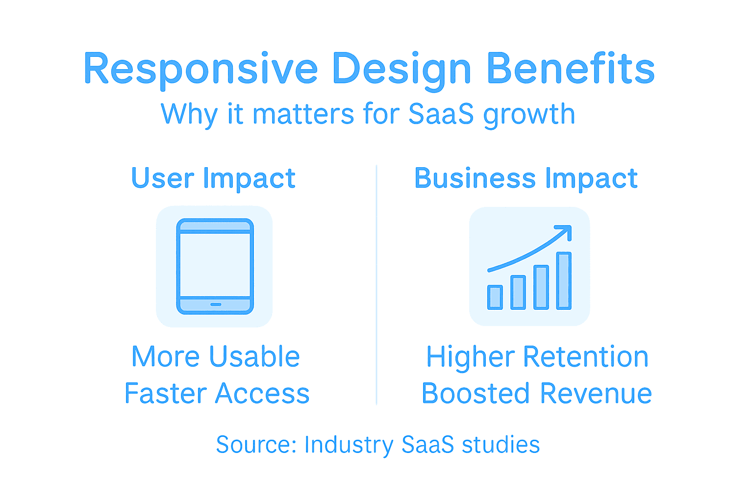
More than 50 percent of web traffic now comes from mobile devices, yet many American SaaS companies still struggle with inconsistent user experiences across screens. For senior product managers and CTOs, optimizing responsive design is no longer just a technical challenge. It is a critical path to driving product growth and improving customer retention. This guide provides clear strategies and proven techniques for building seamless interfaces that elevate engagement and strengthen loyalty across devices.
Table of Contents
- Responsive Design Defined for SaaS Products
- Core Principles and Best Practices Explained
- User Experience Impacts on Activation and Retention
- Revenue Opportunities From a Mobile-First Strategy
- Common Responsive Design Mistakes in SaaS
Key Takeaways
| Point | Details |
|---|---|
| Responsive Design Enhances Usability | Adopting responsive design ensures that SaaS products provide a seamless experience across various devices, enhancing user engagement and reducing drop-off rates. |
| Mobile-First Approach is Crucial | Prioritizing mobile usability in design fosters clearer interfaces, leading to higher retention and conversion rates among users. |
| Performance Optimization is Essential | Fast-loading interfaces and efficient resource management minimize user frustration, significantly boosting interaction times and satisfaction. |
| Regular Testing is Necessary | Conducting ongoing usability tests across devices helps identify challenges early, ensuring a consistently high-quality user experience. |
Responsive Design Defined for SaaS Products
Responsive design represents a strategic approach to creating digital interfaces that dynamically adapt across multiple devices and screen sizes. At its core, responsive design ensures software interfaces maintain usability, readability, and functionality whether accessed on a desktop, tablet, smartphone, or emerging screen technologies.
For SaaS products, responsive design goes beyond simple visual scaling. It involves comprehensive web layout techniques that intelligently restructure content, resize interactive elements, and optimize user experience across diverse digital environments. This approach means navigation menus might collapse into hamburger icons on mobile, form fields could rearrange for touch interactions, and typography automatically adjusts for legibility.
The fundamental principles of responsive design center on flexibility and user-centricity. Key technical strategies include using fluid grid layouts, flexible image sizing, and CSS media queries that detect screen dimensions and apply appropriate styling rules. These techniques allow SaaS products to provide seamless experiences regardless of device characteristics, ensuring consistent brand presentation and maintaining high engagement across platforms.
Successful responsive design requires deep understanding of user behavior, technical constraints, and interaction patterns across different devices. Designers must anticipate how users interact with interfaces on smaller screens, touch interfaces, and varying network conditions while preserving core functionality and aesthetic consistency.
Pro tip: Always prototype and test your responsive design across multiple devices and screen sizes to identify and resolve potential usability challenges before production deployment.
Core Principles and Best Practices Explained
Responsive design for SaaS products demands a nuanced approach that balances technical sophistication with user-centered thinking. Mobile-first design strategies have become fundamental, requiring designers to prioritize compact screen experiences before scaling to larger displays. This approach ensures that core functionality remains accessible and intuitive across all device types.
The technical backbone of responsive design relies on several critical components. Fluid grid systems allow layouts to dynamically adjust proportionally across different screen sizes, while flexible image techniques ensure visual assets scale seamlessly without losing quality. Media queries play a crucial role by enabling conditional styling rules that detect screen dimensions and apply appropriate layout modifications. These techniques collectively create interfaces that feel native and intentional on every device.
Accessibility and performance optimization represent additional critical dimensions of responsive design best practices. Designers must implement touch-friendly interaction zones, ensure readable typography across devices, and maintain consistent navigation patterns. Performance considerations like lazy loading, image optimization, and minimizing resource-intensive scripts become paramount in creating responsive experiences that feel instantaneous and smooth. Advanced responsive techniques now incorporate emerging technologies like container queries and aspect-ratio controls to handle increasingly complex device ecosystems.
Here’s a summary of key responsive design techniques and their impact on SaaS product success:
| Technique | Description | Business Impact |
|---|---|---|
| Fluid Grids | Layouts scale proportionally on all screens | Improved usability and consistency |
| Flexible Images | Images resize without loss of quality | Faster loading, better aesthetics |
| Media Queries | Styles adapt to device screen size | Broader device compatibility |
| Touch-Friendly Interactions | Larger, spaced zones for touch input | Reduced user errors, higher retention |
| Performance Optimization | Minimizing resources and load time | Increased engagement, reduced drop-off |
Successful responsive design transcends technical implementation and requires holistic user experience thinking. Product teams must conduct comprehensive usability testing across diverse devices, continuously refine interaction patterns, and anticipate how users might interact with interfaces under varied contextual conditions. Understanding user behavior, technical constraints, and evolving device capabilities is crucial for creating adaptable, future-proof digital experiences.

Pro tip: Implement a robust device testing matrix that covers multiple screen sizes, operating systems, and interaction methods to identify and resolve potential responsive design challenges early in the development process.
User Experience Impacts on Activation and Retention
Responsive design strategies directly influence user activation and retention by eliminating friction across different devices. When users can seamlessly transition between smartphones, tablets, and desktop environments without compromising functionality, they are more likely to continue using a SaaS product. The ability to maintain a consistent, intuitive experience becomes a critical factor in reducing user drop-off and increasing long-term engagement.
The technical implementation of responsive design profoundly impacts user psychology and behavior. Adaptive interfaces that anticipate user needs and provide smooth interactions can boost retention rates by minimizing cognitive load and frustration. By ensuring that core features remain accessible and performant across all screen sizes, SaaS products create an environment of reliability that builds user trust. This consistency signals to users that the product is thoughtfully designed and committed to providing a high-quality experience regardless of their access point.
Research demonstrates that mobile-first responsive approaches can significantly enhance user retention. Designing with smaller screens as the primary consideration forces product teams to distill interfaces to their most essential elements, creating more focused and streamlined experiences. User experience design principles suggest that reducing interaction complexity leads to faster activation times and higher sustained engagement. By prioritizing clear navigation, readable typography, and touch-friendly interaction zones, SaaS products can create more inviting digital environments that encourage continued use.
Compare traditional desktop-first and mobile-first responsive design strategies for SaaS products:
| Aspect | Desktop-First Approach | Mobile-First Approach |
|---|---|---|
| Initial Focus | Large screen experience | Small screen usability |
| Workflow Complexity | May retain complex UI elements | Forces streamlined, essential UI |
| Adaptability | Often needs retrofitting | Adapts easily to all devices |
| Business Outcomes | Slower engagement, higher friction | Higher retention, improved conversion |
Ultimately, responsive design transcends technical implementation and becomes a strategic approach to user retention. Product teams must view responsiveness not as a checkbox feature but as a fundamental commitment to user accessibility and satisfaction. Continuous testing, gathering cross-device usage data, and iteratively refining interface adaptability are essential for maintaining a competitive edge in the rapidly evolving SaaS landscape.
Pro tip: Conduct quarterly comprehensive device compatibility audits to identify and proactively address potential responsive design friction points across your user base.
Revenue Opportunities From a Mobile-First Strategy
Mobile-first responsive design has transformed from a technical strategy to a critical revenue generation approach for SaaS companies. With over 50% of global web traffic originating from mobile devices, businesses that prioritize mobile user experiences unlock substantial economic potential. The shift represents more than a design trend - it’s a fundamental reimagining of how digital products engage and convert users across diverse technological ecosystems.
The economic implications of mobile-first strategies extend far beyond initial user acquisition. Conversion optimization becomes dramatically more effective when interfaces are intentionally designed for mobile interactions. Streamlined, touch-friendly experiences reduce friction in critical conversion paths, directly impacting revenue metrics. By minimizing cognitive load and simplifying complex workflows, mobile-first approaches can increase conversion rates, reduce abandonment, and create more intuitive paths to product engagement and purchase.
Competitive differentiation emerges as another significant revenue driver of mobile-first design. Companies that demonstrate technical sophistication through seamless cross-device experiences position themselves as user-centric innovators. Mobile responsiveness signals to potential customers that a SaaS product is modern, adaptable, and committed to delivering value regardless of access point. This perception translates into tangible business outcomes - improved customer trust, enhanced brand reputation, and ultimately, more sustainable revenue streams.
Beyond immediate financial gains, mobile-first strategies build long-term competitive advantage. By forcing product teams to distill interfaces to their most essential elements, companies create more focused, performant digital experiences. This approach demands rigorous prioritization, leading to clearer product vision, more efficient development cycles, and solutions that genuinely address core user needs across different contexts and device capabilities.
Pro tip: Implement comprehensive mobile analytics tracking to continuously measure and optimize conversion performance across different device types and screen sizes.
Common Responsive Design Mistakes in SaaS
Responsive design challenges plague many SaaS platforms, undermining user experience and potential growth. Product teams often approach mobile optimization as an afterthought, creating interfaces that fragment and fail across different device types. These technical missteps can dramatically reduce user engagement, conversion rates, and overall platform credibility.
One of the most critical errors involves touch target sizing and interaction design. Many SaaS products create buttons, form fields, and interactive elements that are too small or densely packed for mobile screens, creating frustrating user experiences. Designers must recognize that mobile users rely on fingers, not precise mouse cursors, requiring larger, more generously spaced interactive zones. Small touch targets lead to accidental clicks, increased user errors, and ultimately, higher abandonment rates.
Performance optimization represents another frequent responsive design failure. Static images, uncompressed media, and complex scripts can devastate mobile load times, creating friction that drives potential users away. Successful SaaS platforms implement sophisticated techniques like lazy loading, responsive image sizing, and minimal asset delivery to ensure lightning-fast experiences across all devices. The goal is not just visual consistency, but creating interfaces that feel instantaneous and frictionless regardless of network conditions or device capabilities.
Technical implementation challenges often emerge from rigid, desktop-centric design approaches. Many teams still design for large screens first and then attempt to retrofit mobile experiences, leading to compromised user interfaces. A truly responsive strategy demands a mobile-first perspective, where core interactions are conceived for smaller screens and then progressively enhanced for larger displays. This approach forces teams to prioritize essential functionality, create more intuitive workflows, and develop genuinely adaptable digital products.
Pro tip: Conduct monthly cross-device usability testing with real users to continuously identify and eliminate responsive design friction points before they impact your product’s growth.
Unlock SaaS Growth with Expert Responsive Design Leadership
Responsive design is more than a technical requirement—it’s a critical factor that drives user activation, retention, and long-term revenue for SaaS products. Yet many SaaS teams struggle with challenges like inconsistent cross-device experiences, poor mobile usability, and sluggish performance that frustrate users and increase churn. If you want to turn responsive design from a hurdle into a growth engine your product needs experienced design leadership focused on seamless, mobile-first strategies that align UX with business goals.
The Good Side Oy partners with established, growth-oriented SaaS companies to provide embedded senior design expertise that goes beyond surface-level UI fixes. We help your team solve problems like touch-friendly interactions, fluid grid layouts, and performance optimizations that the article highlights as crucial for responsive success. Our designers collaborate tightly with product and engineering teams to drive measurable outcomes in user activation and retention.
Ready to elevate your SaaS product with strategic responsive design leadership that creates exceptional cross-device experiences?
Explore how The Good Side accelerates SaaS product growth
Get in touch now to access flexible, outcome-driven design expertise that integrates seamlessly into your team. Don’t let outdated desktop-first thinking slow your growth. Visit The Good Side Oy today and make responsive design your competitive advantage.
Frequently Asked Questions
What is responsive design in SaaS?
Responsive design in SaaS refers to an approach that allows software interfaces to adapt dynamically to different devices and screen sizes, ensuring usability, readability, and functionality on desktops, tablets, and smartphones.
Why is responsive design important for SaaS growth?
Responsive design is crucial for SaaS growth because it enhances user experiences by allowing seamless transitions between devices, ultimately driving user activation, retention, and satisfaction. A well-implemented responsive design can lead to higher engagement and reduced user drop-off.
What are the core principles of responsive design?
The core principles of responsive design include flexibility, user-centricity, fluid grid layouts, flexible images, and CSS media queries. These elements help create interfaces that are consistent and effective across various devices.
What common mistakes should be avoided in responsive design for SaaS?
Common mistakes in responsive design for SaaS include inadequate touch target sizing, poor performance optimization, and a desktop-first design approach. These issues can lead to frustrating user experiences and negatively impact user engagement and conversions.