How to Design Intuitive Interfaces for SaaS Success
Building a successful SaaS product starts with understanding how real american users think and act. Studies show that nearly 80 percent of customers abandon confusing software after just one bad experience, making clarity and usability mission critical. Whether you are refining workflows or designing new product flows from scratch, a user-centered approach helps you meet these expectations. This guide breaks down key steps that will help you create a more intuitive, satisfying interface for every user.
Table of Contents
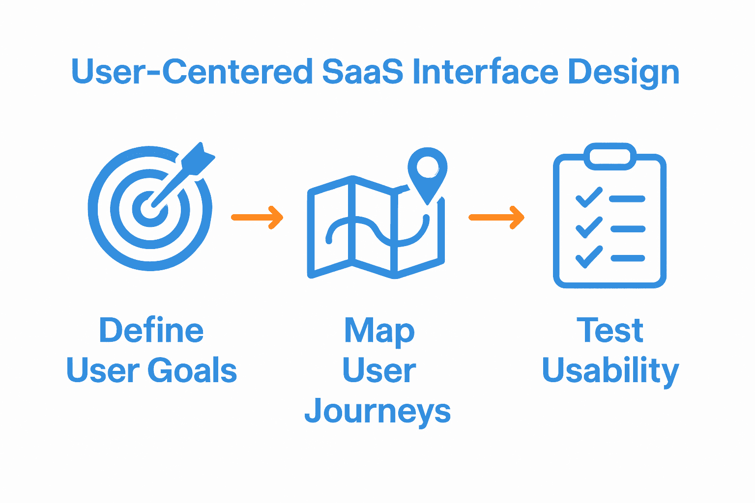
- Step 1: Define User Goals And Key Workflows
- Step 2: Map User Journeys And Identify Pain Points
- Step 3: Create Wireframes And Prioritize Clarity
- Step 4: Apply Visual Hierarchy And Saas Best Practices
- Step 5: Test Usability And Refine Interactions
- Step 6: Validate With Real Users And Measure Outcomes
Quick Summary
| Key Insight | Explanation |
|---|---|
| 1. Define User Goals Thoroughly | Conduct in-depth user research to identify specific tasks, pain points, and desired outcomes to inform your design. |
| 2. Map User Journeys Accurately | Document every user interaction from discovery to engagement to find and address pain points effectively. |
| 3. Create Clear Wireframes | Design low-fidelity wireframes focusing on user flows and ensuring clarity in structure without distractions. |
| 4. Establish Visual Hierarchy | Organize design elements by importance using size, color, and spacing to guide user navigation effectively. |
| 5. Test Usability Intensively | Recruit a diverse user group for thorough testing to gain insights that lead to significant design improvements. |
Step 1: Define user goals and key workflows
Defining user goals and key workflows is the critical foundation for creating an intuitive SaaS interface that drives meaningful user engagement and product success. According to Wikipedia, usability goals are objective criteria used to assess the efficiency, effectiveness, and satisfaction of a product, ensuring it meets user needs and expectations.
To effectively define user goals, start by conducting comprehensive user research through interviews, surveys, and direct observation. Map out the precise tasks and objectives users want to accomplish within your software. Identify their primary pain points, desired outcomes, and the specific steps they currently take to achieve their goals. A workflow, as defined by Wikipedia, represents a systematic sequence of tasks that processes information or provides services. By understanding these workflows, you can design interfaces that streamline user actions and reduce unnecessary complexity.
Pro tip: Create user personas and journey maps to visualize different user types and their unique interaction paths. This approach helps you design flexible interfaces that accommodate diverse user needs while maintaining a consistent, intuitive experience. Always prioritize simplifying complex processes and eliminating unnecessary steps that might frustrate or confuse your users.

In the next step, you will translate these insights into a comprehensive interface design strategy that aligns directly with user expectations and workflow requirements.
Step 2: Map user journeys and identify pain points
Mapping user journeys and identifying pain points is a crucial strategy for creating an intuitive and user-friendly SaaS interface. According to Userflow, customer journey mapping enables you to identify and address pain points that could cause users to drop off, leading to reduced churn and increased user loyalty.
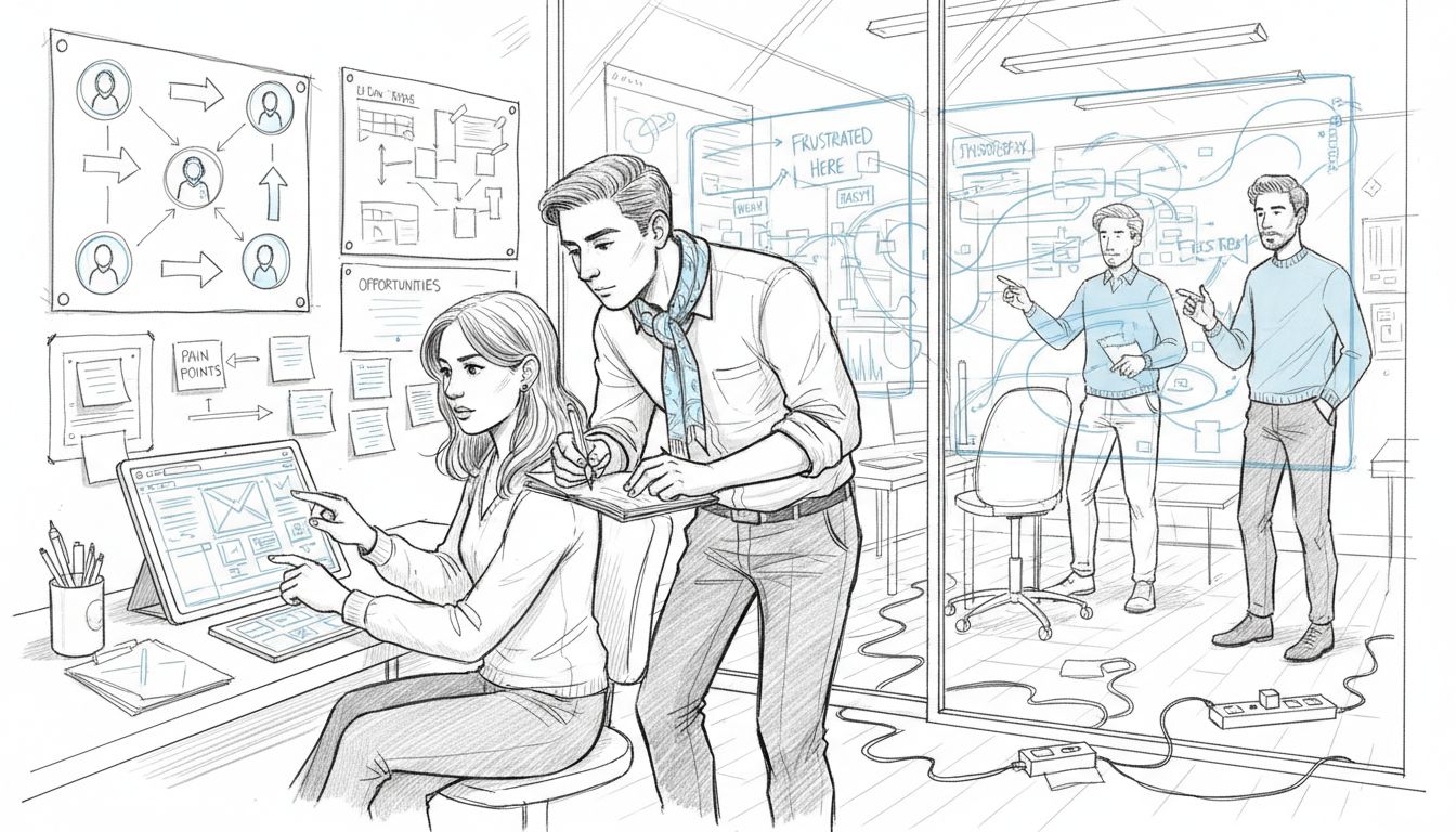
To effectively map user journeys, start by documenting every interaction a user has with your product from initial discovery to long term engagement. Break down each stage of the user experience into detailed steps including awareness, consideration, signup, onboarding, active usage, and potential expansion. Productled emphasizes the importance of incorporating potential customer emotions into your journey map, which helps focus on positive experiences and move customers away from negative thoughts.
Pro tip: Use a combination of qualitative and quantitative research methods to gather comprehensive insights. Conduct user interviews, analyze behavioral data, review support tickets, and create empathy maps to uncover hidden friction points. Pay special attention to moments of hesitation, confusion, or drop off in your user flow.

By systematically documenting these experiences, you can design targeted interventions that smooth out rough edges in your product experience.
In the next step, you will transform these journey insights into specific design recommendations that directly address user needs and streamline their interactions with your software.
Step 3: Create wireframes and prioritize clarity
Creating wireframes is a critical step in designing intuitive SaaS interfaces that communicate complex functionality with simplicity. Wikipedia highlights how visual front ends can help users build and modify applications with minimal technical expertise by emphasizing clarity in design.
Begin the wireframing process by sketching low fidelity layouts that focus on core user flows and information hierarchy. Use simple grayscale representations that strip away visual distractions and concentrate on structural elements and user interactions. According to Wikipedia, effective work systems involve human participants and machines performing tasks using information and technology to produce services, which underscores the importance of creating clear and logical workflows in your wireframes.
Pro tip: Leverage tools like Figma or Sketch to create interactive wireframes that allow you to test navigation and user experience before investing in high fidelity design. Focus on creating consistent visual language where form follows function.
Prioritize negative space, clear typography, and intuitive navigation patterns that guide users seamlessly through your interface.
In the next step, you will transform these wireframes into more detailed prototype designs that bring your interface vision to life.
Step 4: Apply visual hierarchy and SaaS best practices
Applying visual hierarchy is crucial for creating an intuitive and engaging SaaS interface that guides users effortlessly through your product. ArXiv research emphasizes the critical importance of understanding key features that differentiate SaaS products from conventional software, highlighting the need for strategic design approaches.
To establish effective visual hierarchy, start by organizing content based on importance using size, color, contrast, and spacing. Use larger fonts and bolder colors for primary actions, while keeping secondary elements more subdued. According to STC, understanding user thoughts and feelings at each interaction stage is crucial for designing interfaces that intuitively guide user choices and interactions.
Pro tip: Implement a consistent design system that creates a predictable and comfortable user experience. Use color psychology strategically select colors that not only look appealing but also communicate different levels of information and guide user attention. Ensure your most critical actions stand out while maintaining a clean and uncluttered interface that doesnt overwhelm users with too many competing visual elements.
In the next step, you will refine these design principles through user testing and iterative improvements to create a truly user centered interface.
Step 5: Test usability and refine interactions
Usability testing is the critical final phase of creating an intuitive SaaS interface that genuinely meets user needs and expectations. Theseus research emphasizes the importance of identifying touchpoints, pain points, and opportunities to improve customer experience through detailed journey mapping.
Begin your usability testing by recruiting a diverse group of users representative of your target audience. Conduct both moderated and unmoderated testing sessions that capture quantitative and qualitative insights into user interactions. According to dScout, effective testing requires a comprehensive checklist covering emotions, behaviors, pain points, motivations, and potential opportunities for interaction improvement.
Pro tip: Implement a structured feedback mechanism that goes beyond surface level observations. Use techniques like think aloud protocols, screen recording, and in depth interviews to uncover not just what users do, but why they make specific choices. Create detailed artifacts like heat maps, user flow diagrams, and interaction timelines that help you quantify and visualize user experience challenges.
In the final stage, you will synthesize these testing insights into actionable design improvements that create a more intuitive and user friendly SaaS interface.
Step 6: Validate with real users and measure outcomes
Validating your SaaS interface design through real user feedback is the ultimate test of your product’s usability and effectiveness. According to MacAccelerator, selecting the right validation approach is critical to ensuring that your mapping process aligns with specific SaaS goals and produces measurable outcomes.
Conduct structured validation sessions that combine quantitative metrics with qualitative insights. Use a mix of methods including user interviews, task completion tests, and detailed feedback surveys. Insight7 emphasizes the importance of mapping journey pain points to visualize customer engagement across key touchpoints, allowing you to understand precisely how users interact with your interface.
Pro tip: Implement a comprehensive measurement framework that tracks both objective performance indicators and subjective user satisfaction. Capture metrics like task completion time, error rates, and user satisfaction scores. Create comparative analyses that show how your design iterations improve user experience over time. Pay close attention to drop off points, user hesitation, and areas where users struggle to complete intended actions.
In this final stage, you will transform user validation insights into continuous design improvements that evolve your SaaS interface to meet changing user needs.
Transform Your SaaS Interface Into a User-Centered Success
Struggling with complex workflows and unclear user journeys in your SaaS product is common but can hold back your growth and user satisfaction. This article highlights essential steps like defining clear user goals, mapping out detailed user journeys, and applying visual hierarchy to create intuitive interfaces that engage and retain customers. If these challenges sound familiar, you’re not alone.
Bold action is needed to turn disconnected touchpoints and frustrating user experiences into cohesive and high-performing designs. The Good Side Oy specializes in delivering exactly that through expert UI/UX design, user research, and strategic alignment. Our flexible engagements help SaaS teams rapidly improve usability and boost activation and conversion without the delays of traditional hiring. Start with a free design audit and join companies accelerating their growth with clear, actionable design solutions.

Ready to elevate your SaaS product with a seamless user experience that drives revenue and reduces churn Explore how The Good Side can transform unprofessional interfaces and scattered user journeys into engaging success stories. Take the next step now by visiting our landing page and discovering our proven approach to end-to-end user journey optimization and focused UI/UX design.
Frequently Asked Questions
How can I define user goals for my SaaS interface?
To define user goals for your SaaS interface, start by conducting user research through interviews and surveys. Collect information about what tasks users want to accomplish and their pain points, then summarize these insights into clear objectives for the design.
What are the key steps in mapping user journeys?
Mapping user journeys involves documenting every interaction a user has from initial discovery to long-term engagement. Break down the user experience into distinct stages, identifying specific actions, emotions, and pain points to guide your interface design decisions.
How do I create effective wireframes for a SaaS product?
Creating effective wireframes requires focusing on core user flows and information hierarchy. Start with low-fidelity sketches that emphasize structure and interaction, and then transition to interactive designs to test user navigation.
What should I consider to apply visual hierarchy in my SaaS interface?
To apply visual hierarchy, organize content based on importance by using size, color, contrast, and spacing. Make critical actions prominent with larger fonts or bolder colors while ensuring that secondary elements are visually subdued to avoid overwhelming users.
How can I test usability in my SaaS interface?
Testing usability involves recruiting a diverse user group to conduct moderated and unmoderated sessions. Capture both qualitative and quantitative data about user interactions, focusing on pain points and areas for improvement in the interface.
What are effective methods to validate my SaaS interface design?
Effective validation methods include structured testing that combines qualitative insights with quantitative metrics. Utilize user interviews, task completion tests, and feedback surveys to measure user satisfaction and interaction effectiveness, allowing for continuous design improvements.